BLOG
THE ARTIST BEHIND OUR BEAUTIFUL WINE LABELS
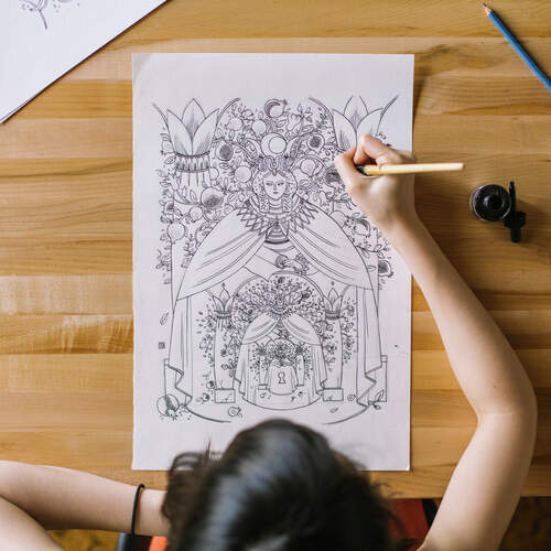
One of the things that clearly separates Prophecy from the competition is our distinct labels. Let’s take a look at the artist behind them, Victo Ngai.
Creating her own worlds
Victo Ngai had an eye for illustration from a young age going back to her days growing up in Hong Kong, where she suffered from dangerous fevers which often left her alone. “I started creating my own stories, drawing out characters and scenes. That was the earliest form of illustration and storytelling I was doing,” she says. I guess you could call them my imaginary friends.”
Fortunately, Victo’s mother noticed her talent and thought the rigid and technical Chinese art taught in her school was detrimental and instead arranged for her to study under a looser private art teacher in Shenzhen in mainland China. It was there that her confidence in her creativity began to flourish.
Upon graduation, she was accepted to the Rhode Island School Of Art and Design. Once there a career as an illustrator began to take shape. Early assignments included working on projects with prestigious clients like the New York Times and the New Yorker, where she worked with art director Jordan Awan. “What impressed me most about Victo was not just her technical proficiency and imaginative imagery,” Jordan said, “but her ability to really tell a story, to pull a narrative out of something.”
Aligning visions with Prophecy
Victo likes to create realities through her art, so naturally she was a good fit for Prophecy, as we wanted to develop distinct wine labels that would speak to the different flavor cues in the wine and build on the feeling you have when you drink one of our wines.
“I like to twist the rules of the reality we are in. To make [an image] believable, you don’t actually have to apply the physics of this world. You can make up your own physics, if they’re consistent. But if you break the [rules] of your own language, the picture falls apart.”
Victo saw the opportunity with Prophecy as more of a collaboration than a commission. When we decided to use Tarot cards as the inspiration behind the labels she wanted to stay true to their meaning and iconography, realizing that there is deep meaning behind the symbols. “Wine has been around for a long time and it’s very layered and just like a Tarot card, if you gather with different cards and different pairings you get different meaning to it.”
She’s also thrilled with the medium of wine bottles. “Being able to be part of beautiful objects in a long tradition like this is very cool.”
Want more information? Explore Victo’s illustrations for Prophecy wines.